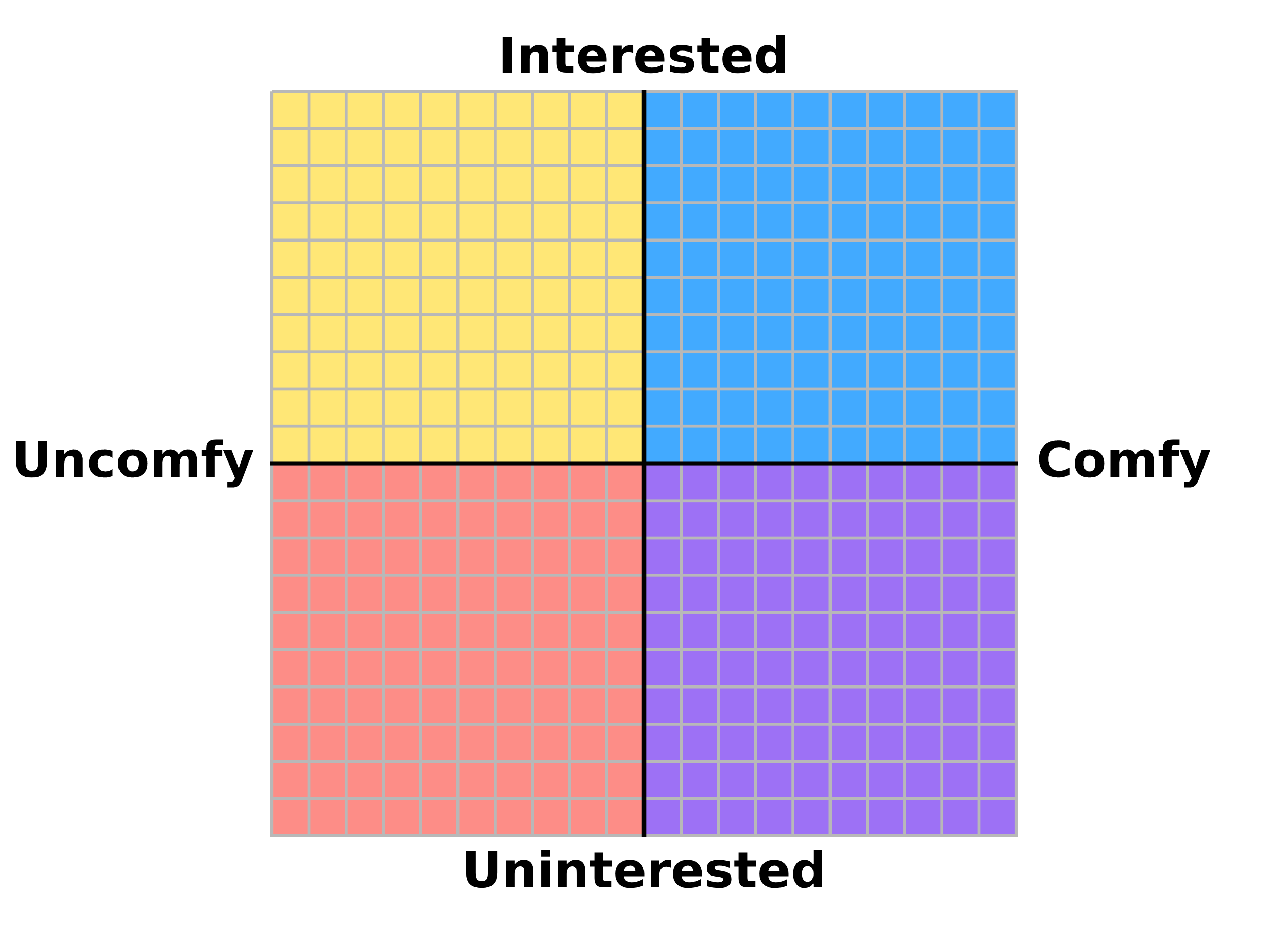
The PSS Compass stands for the Personal Social Standing Compass. It's a compass of your own, where you plot your friends and family based on how you think you socially stand with them. This isn't like a political compass, so you don't have to take a test, and none of the friends you're plotting have to either. If anything, you're testing yourself by thinking over how you see different friends, family, or aquaintances based on how you see everyone else, and plotting them on a graph based on the two amounts you give each of them. I (PercyCho), made this as a way to sort out what type of friends I have by placing them in 4 main quadrants. But before that, let me explain the two axes:
The X axis represents your personal comfort with that person. The more comfortable you are around the person you're plotting, the more to the right side of the compass they'd go, and the less comfortable you are, the more to the left side of the compass they'd go. This axis is purely for you to decide based on interactions you've had with this person in the past. Sure, you might be able to hold a conversation, but did they talk about, or do something that went out of your comfort zone? If so, plot them more to the left side. However, if this is a person that you feel comfortable talking to, doing stuff with, and appreciate as a friend, plot them more to the right side.
The Y axis represents what the person's social experience is. "Social experience" is a little more complicated, but it's more based on how the person acts than what your opinion of them is. The more social experience a person has, which would mean the person is more extroverted, knows and respects their friendship with you, and knows the right thing to do in a situation, the higher they would go on the graph. However, if the person is more introverted, doesn't understand the friendship they have with you or doesn't respect social bounderies, or doesn't usually do the right thing in a situation, the lower on the graph they would go.
After plotting people on both axes from -10 to 10 (or 0 to 20, and then minus 10), they should fall in one of 4 quadrants. The first quadrant is the Friend quadrant! People who get plotted above 0 in both categories end up in the blue region of the compass, which means for the most part, you are friends! The more to the top-right they are, the better friends they are with you.
People in this quadrant are still your friends, and while they might be more introverted and less socially experienced than others, you still feel comfortable with them as a friend.
People in this quadrant might be people who know what their friendship is with you, and respect it, but they aren't someone you're comfortable talking with, or doing stuff with, and you don't look forward to interacting with them. However, they know their social bounderies with you, so this doesn't happen often.
People in this quadrant are unlucky enough to be plotted in the negative for both axes, which means they aren't comfortable to be around, and don't respect social bounderies. While the person could just be low on the Y axis because they're introverted, not because they don't understand their friendship with you or don't respect it, you're more likely to know a person in this quadrant from them being socially inept than them just being introverted. These people might ask to talk or hang out more than you want to, or ask uncomfortable questions that you might feel socially obligated to answer nicely instead of truthfully. For these reasons, they are "clingy" friends.
Tip Number 1: Don't use recency bias. You might have just had a disagreement with a good friend and don't think highly of them when you find out about this graph and decide to plot your friends on it. But that doesn't mean you should let that one disagreement with a person who you're good friends completely influence where you plot them on the compass. Think back to all the past experiences you've had with them, and base how you plot them off of that instead of something recent, which is temporary.
Tip Number 2: Don't lie about who you're plotting. If you feel like a friend is at a certain place on the compass which they might not like to be, don't rank them higher/lower than they should be. Sure, you can nugde the numbers one way or another based on certain experiences you remember having with them, but you shouldn't completely re-write the numbers that wouldn't be truthful for how you actually feel about them.
Tip Number 3: Don't do this too often. Friendships change. There are highs and lows with each friend or family member, but that doesn't mean you should immediately re-plot them each week. Do this test once in a while at most, doing it any more is probably unhealthy.
Tip Number 4: Once you're done filling out your compass, fullscreen your browser, zoom in the page ("Ctrl" + "+" for Windows) so the compass fits the screen, and screenshot the screen in order to record your results the best.
Tip Number 5: You can have more than just 2 axes. While the chart only has two axes, X and Y, you can add 3 more by changing the color of the dot, which can either follow Hue, Saturation, and Value levels (HSV) or Red, Green, and Blue levels (RGB).